Lavu Ratnakar on Using Color Theory to Enhance Your Design
Color plays a significant role in how people perceive and interact with designs. Whether it’s a logo, a website, or a product, the right use of color can make a design more appealing and effective. Color theory, which outlines how colors work together, is a fundamental tool for designers who want to create impactful visuals. Seasoned graphic designer, Lavu Ratnakar, explains how applying color theory can elevate design work and communicate the intended message.
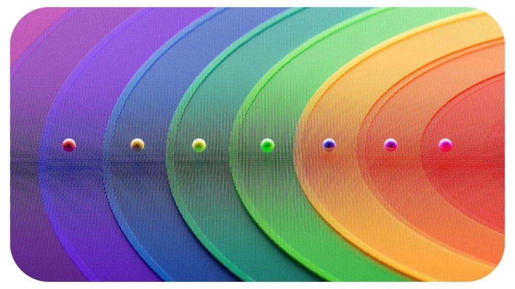
Understanding the Basics of Color Theory
Color theory begins with the color wheel, which organizes colors in a circular diagram. Primary colors such as red, blue, and yellow sit at the core. Secondary colors like green, orange, and purple are created when mixing primary colors. Tertiary colors are made by blending primary and secondary hues.
The color wheel reveals relationships between colors as it arranges them. Complementary colors, which sit opposite each other (like blue and orange), create contrast when paired. Analogous colors, which sit next to one another, offer harmony and balance. These relationships are not arbitrary; they influence how colors work together and the emotions they evoke.
“Color isn’t just a visual element,” says Lavu Ratnakar. “It carries psychological weight. People associate colors with specific emotions, values, and cultural meanings. For instance, red often conveys energy, passion, or urgency. Blue evokes calmness, trust, or professionalism. Yellow, on the other hand, radiates warmth and optimism but can also signify caution when used in certain contexts.”
Although some color associations are universal, others vary by culture, industry, or context. Green may represent growth and nature in one context, but it might symbolize wealth or envy in another. Designers must consider the intended audience and context when choosing a color palette to avoid miscommunication or unintended associations.
Color Schemes and Their Role in Design
A well-chosen color scheme can define the tone of a design. There are several ways to select colors for a project, each with a specific effect. Monochromatic color schemes use variations of one hue to create a cohesive and minimalist look. This type of scheme works well in modern designs where simplicity is key.
Triadic color schemes, which choose three colors evenly spaced around the color wheel, add excitement and visual interest. The challenge with triadic schemes lies in maintaining balance. Too much saturation can overwhelm the viewer. Designers often choose one dominant color while using the other two as accents.
Split-complementary schemes offer a more subtle alternative to complementary schemes. By combining one base color with the two colors adjacent to its complement, this scheme provides contrast and harmony without the intensity of true opposites. Designers who want dynamic visuals without risking visual tension often rely on this approach.
The Role of Contrast and Balancing Brand Identity and Functionality
Color directly affects usability and accessibility. High-contrast designs ensure that text stands out from backgrounds, making it easier to read. Poor contrast, such as light gray text on a white background, can frustrate users and reduce engagement.
Notes Ratnakar, “Accessibility is an essential consideration. Designers should ensure that their work is usable by people with visual impairments, such as color blindness.”
Tools that simulate different visual conditions can help identify areas where contrast needs improvement. Using patterns or textures alongside color is another way to make designs more inclusive.
A well-executed color palette reinforces brand identity. Global brands like Coca-Cola and Nike use consistent colors across packaging, advertising, and digital media to establish recognition. When choosing colors, a balance must be struck between brand identity and functionality.
An e-commerce site might use a bold accent color like orange or red for “Buy Now” buttons to draw attention. While the primary brand colors may dominate elsewhere, these contrasting action colors guide users toward specific actions. A successful design considers both branding and the needs of the people interacting with it.
Evoking Emotion and Avoiding Color Mistakes
Designers rely on color to influence emotion and behavior. Warm colors like red, orange, and yellow stimulate energy and excitement. These tones are often used in industries like food and entertainment, where engaging users quickly is key. Cool colors like blue and green, by contrast, create calm and trust, making them popular in healthcare, finance, and technology.
Neutral colors such as gray, beige, and white provide balance and sophistication. These shades are often used as backgrounds to avoid overwhelming viewers while allowing other colors to shine. Designers can also pair neutral tones with bold colors to emphasize certain aspects of a design, such as call-to-action buttons or important text.
Poor color choices can undermine even the most thoughtful design. One common error is overloading a palette with too many colors. This creates visual chaos and distracts from the message. Limiting a palette to three to five core colors ensures a design stays cohesive and focused.
Another mistake is ignoring context. Colors that work well on-screen may not print accurately. Designs intended for both web and print need careful testing to ensure consistency across mediums. Designers should also consider cultural differences—colors that symbolize prosperity in one region might carry negative connotations elsewhere.
“Designers should think about surrounding content. Colors that work individually may clash when placed next to certain photos, videos, or text. Testing layouts in real-world scenarios helps catch these issues early,” says Ratnakar.
Tools to Simplify Color Selection
Designers don’t need to rely on guesswork when choosing colors. Tools such as Adobe Color, Coolors, and Canva’s Color Palette Generator can help streamline the process. These resources allow users to experiment with various schemes, simulate color blindness, and test contrast ratios for accessibility.
Some tools also analyze photos to extract harmonious palettes, offering inspiration from natural landscapes or everyday objects. This approach blends creativity with practicality, giving designers a starting point while ensuring that their choices enhance the design’s message.
As design trends evolve and technology continues to shape user expectations, the role of color theory in design will only grow more sophisticated. Future advancements in artificial intelligence and machine learning will enable even more personalized and dynamic color experiences, tailoring palettes in real-time based on user preferences, behaviors, and cultural nuances. Designers will increasingly leverage data-driven insights to predict emotional responses and optimize engagement through color choices.
The demand for inclusive and accessible design will push color theory beyond aesthetics, emphasizing functionality and user experience. Tools that simulate diverse visual impairments will become standard practice, ensuring that every design communicates effectively to all audiences. Sustainability trends may also influence color usage, with eco-conscious brands adopting palettes that reflect environmental values and social responsibility.
Emerging technologies like augmented and virtual reality will open new dimensions for color application, challenging designers to create immersive environments where color guides interaction and evokes emotion in multidimensional spaces. As Lavu Ratnakar emphasizes, mastering color theory is not a one-time achievement but an ongoing journey. The designers of the future will need to be both artists and strategists, blending creativity with science to craft visuals that resonate deeply with diverse and global audiences.

Recommended For You
How to Succeed with a Production Company
Most Inside Editorial Team
MostInside is an independent publication focused on growth across lifestyle, business, finance, sports, and digital authority, prioritizing long term value and enduring credibility.


