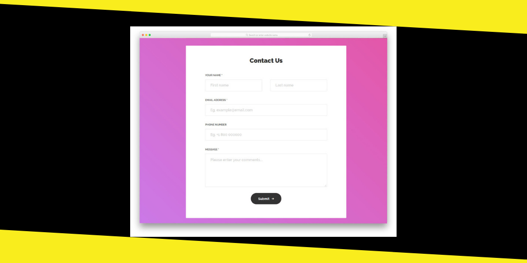
An eye-catching, comprehensive, and well-equipped contact form makes the difference. Visitors do not like lengthy and complicated forms. It should be clear and easy to understand. You have to take into deliberation the necessary aspects to choose the contact form design. Hire professionals who offer web development services and create a responsive contact form design.
1. Hootsuite
Hootsuite is the best choice when agencies are looking for technical solutions. It also has a user-friendly contact page design. Some people prefer a single contact page to handle every feature. However, Hootsuite divides the contact form into two sections, such as “Contact Sale” and “Contact Support.” User does not feel any inconvenience as he/she finds instructions at every step.
2. Zendesk
Zendesk is a package of different contact options. Creativity is its beauty and unique characteristic. Zendesk is for people who want everything at single contact form. People feel calm while operating it. It has an option for product support.
3. Scribed
Scribed has given extra colors to the Hootsuite’s approach. It has six different types of contact options. Visitor taps on the relevant button to proceed. Click I need help to open the contact box. It has a simple and clutter-free contact design.
4. WP Engine
It is one of the best choices for WordPress hosting. Simplicity is the major characteristic of the contact design. The design is equipped with 24/7 support panel. Visitors do not feel complication to get technical support when they confront any problem.
5. Active Campaign
Active Campaign can get the job done effectively though some people do not praise it. The contact page has many options that may prove obstruction for some users. On the contrary, a great number of users prefer the Active Campaign for its simplicity and clarity.
6. The Footer Form
Footer form designs for contact can be very productive. The contact page remains at the footer of the website. The professional web designer prefers the footer forms instead of the dedicated contact page forms. It is also beneficial from SEO viewpoint. The pretty design helps to engage visitors.
7. Envato
It is hard to differentiate the Envato homepage and the contact page. However, the contact form design does not puzzle the visitors. They can easily figure out the desired feature to contact. Click on the service button, and the relevant panel will pop out. Do you want to offer multiple services across different websites? Yes! Envato contact form design will serve your needs.
8. Yummygum
The visitor has to follow a two-step procedure to browse the contact form. You find the Contact button in website’s header. Tap on it to open further features. Contact team to get the answer to your questions. Contact page welcome visitors, so you feel comfortable.
9. Infusionsoft
Infusionsoft has an easy interface of the contact page. The user finds the different contact options down to the page. The primary focus is laid on the live chat. Trends have changed regarding contact forms. These pages are not visible in the first view of the page. The visitor has to explore some pages to find the contact icon. However, Infusionsoft has kept contact form down to the first page.
10. Pixpa
Pixpa is simple to unfold the three-field contact form. Feature of calls-to-action on header and footer makes it only one of its kind. The visitor may sign up for free trial. Many web developers prefer the application of Pixpa.
Your business should take into account the impacts of contact form designs. The contact page is a medium to build a long-lasting relationship with the customers, so choose it wisely.