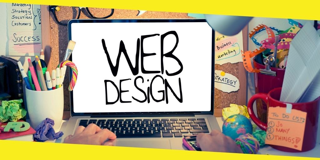
What Are the Common Web Design Mistakes?
This post was last updated on February 1st, 2024

Aesthetic website design is a must to grow your business. You cannot have a good response and user-friendliness if your site is not interesting enough to keep the audience stick to it. A functional website is something that continually catches viewers attention with its functions and properties. It is all profit then.
Do you know anything about legal web design? It relates to the website design that law firms offer for their lead-generating goals. Similarly, any type of business has their niche and web marketing should be centered around your type of business and its needs.
Most of us know what a good website contains, but we are always doubtful about the possible mistakes that go unnoticed, and this is where we make blunders.
Let’s read what these mistakes are about and how to avoid them:
Using Inappropriate Images
Images are an essential part of a website; they send the message faster than text. A reader can have a look at pictures on a site and get what the entire content would be all about; however, you must know what images are relevant and suitable according to the data you have provided there. Low-quality images would give a terrible impression of your site, and readers would not be encouraged to go further.
Writing Low-Quality Content
As a marketer, you need to have a keen strategy to write excellent and appealing content for your site. Content is something that gives complete information about the services you provide, the products you sell, and the kind of business you run. Focus on the font style, size, and how well-put your content is on the site. It must be updated now and then to show that you are an active business holder; it would also improve your Search Engine Optimization. The more informative and unique your content, the more readers you gain.
Deficient Call-to-Action
Your CTA must be simple yet complete. A poor CTA is a severe drawback about your site, and it is one of the most typical mistakes one makes. You do not need to confuse your readers by showing them your CTA repeatedly. Give them some time to skim through the page and understand the information provided there.
Showing Too Much or Too Little
Your website must have adequacy and order. It should consist of average data and images; everything should fit the business’ theme and overall idea. When your visitors arrive at your website, they want to see that things are well-organized and not in the wrong place.
Going too hard on your site would make it slower as well, which will, in turn, make the users frustrated. Just plan and plot what exactly your content will revolve around.
While on the other hand, websites that have almost nothing worthy to catch up on give just the worst impression of a business. The absence of eminent information is absolutely a turn-off. ‘Less is more’ sounds good when mediocrity is in the right manner. You have to remember one thing: your site should enable users to understand your brand or product well.
Poor Load Time
Other than all these mistakes, the user will undoubtedly bounce if your website takes a lot of time to load. Survey says that a website loading within 3 seconds is an acceptable speed for the visitor to remain on site.
Lack of Communication
Also, it would be best if you do not avoid your users. Try staying in touch and answering their queries as soon as you get them; this will make them realize that you are responsive and careful towards your customers.
Website design is a big deal for your business. And, it takes hard work. Keep all these tips in mind the next time you are designing a site or before hiring a Web Design Company.
You may like this
Recommended For You
Get Unlimited Followers for Your Instagram | Getinsta
Most Inside Editorial Team
MostInside is an independent publication focused on growth across lifestyle, business, finance, sports, and digital authority, prioritizing long term value and enduring credibility.


💕 Help full blog lots of information about it, Thank you admin for providing this information….
💕👉 Hi, WELCOME TO Hairdressers near me!
“Best Home Salon Care” is an in-home salon service that specifically caters to Seniors and People with Disabilities in the comfort of their own homes.